Medific Style Guide
Medific stands out as an elegantly designed Webflow template tailored for DNA testing labs, medical laboratories, vaccine centers, and MedTech startups.
It was designed and developed by the team of Creative Experts at EGO Creative Innovations.
On this page you will find detailed guidelines how to use prebuilt Styles so your final site looks gorgeous!
Colors
Template Primary
Typography
The typographic hierarchy aims to create contrast between the most significant and minor elements of the text. Contrast is created by adjusting typography elements, including fonts, their size, style and color, and their alignment.
Text styles
Body text
Body L
Body M
Body S
Additional styles
Support styles
Quotes
“You know you're in love when you can't fall asleep because reality is finally better than your dreams.”
RICH TEXT
What’s a Rich Text element?
What’s a Rich Text element?
What’s a Rich Text element?
What’s a Rich Text element?
What’s a Rich Text element?
What’s a Rich Text element?
The rich text element allows you to create and format headings, paragraphs, blockquotes, images, and video all in one place instead of having to add and format them individually. Just double-click and easily create content.
- Unordered List
- Unordered List
- Unordered List
- Unordered List
- Ordered List
- Ordered List
- Ordered List
- Ordered List
“You know you're in love when you can't fall asleep because reality is finally better than your dreams.”
A rich text element can be used with static or dynamic content. For static content, just drop it into any page and begin editing. For dynamic content, add a rich text field to any collection and then connect a rich text element to that field in the settings panel. Voila!
Static and dynamic content editing
Static and dynamic content editing
Text alignment
You can set alignment for text elements by adding a class name from below.
TAR
Text align right
TAL
Text align left
TAC
Text align center
TAJ
Text align justify
Spacing
Spacing classes provides you set of classes which will help you to build and maintain consistent spacing across components, blocks, sections, etc.
Spacing Scale
Use the spacing scale for components or sections. This scale is applied and used within all components and sections. Spacing available in the system:
Buttons
Buttons are one of the most important components, as they help people communicate with the system and get expected feedback and result from it.
TheSprkl supports large variety of button styles and can serve plenty of purposes. Every button group supports different button size and button type (icons buttons, fab). All button groups sorted by importance (primary, secondary, outline, ghost, tertiary buttons).
Primary
Secondary
Buttons / Secondary / Default
Customize
General button styles applied to the Button class and for all buttons defined min-width, so they will look consistent even, if the text is short. To achieve different button size please add size combo class after Button class, e.g. Button Size L
Links
Links are the useful tool that makes information more structured and wider. You can mark the link in different ways: underlined, boxed, default. This demo lets you preview the link component, its variations, and configuration options.
Link / Icon Left
Link / Icon Right
Customize
In order to style links use Link global class and add one of the combo classes Dark, Pale or Light. Same classes could be applied to Link Blocks and will affect not only text, but icons too. Note that each style have its own states and for now style states won't affect icons.
Link
Link Dark
Link Pale
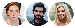
Avatars
Avatars, also known as a profile picture or userpic, is a graphical representation of a user or the user's character or persona. Avatars are used to show a thumbnail representation of an individual or company in the interface. Avatars occur widely in material design and use almost everywhere from tables to dialogue menus.
Components
You may choose a preferable option:
Six sizes: XXS, XS, S, M, L, XL;
Three types: icon, picture, letter;
Two variants: circular and rounded square.
Avatars / Circular / Placeholder
Customize
You can quickly customize each size of an avatar through the parameter “size.”
Alerts
Alerts / INFO / Default
Alerts / INFO / With Description
Alerts / INFO / Simple
Success
Let to the user know that his action acheived the goal.
Alerts / Success / Default
Alerts / Success / With Description
Alerts / Success / Simple
Error
Show the failure after the action.
Alerts / Error / Default
Alerts / Error / With Description
Alerts / Error / Simple
Warning
Any important content.
Alerts / Warning / Default
Alerts / Warning / With Description
Alerts / Warning / Simple
Customize
Forms
Forms / Inputs / Default / Size
Text area
Forms / Inputs / Text Area / Default /
Select field
Select fields exclusively prepared only for Webflow forms. In Figma instead of Select fields use dropdowns.
Toggles
Dropdowns
Dropdowns are small overlays that opens on demand. They let users access additional content and actions without cluttering the page. It is usually used for navigation or forms.
Dropdowns / Secondary
ClearPath™ is a prescription medical device.This information is for educational purposes only and is not medical advice.Only a qualified physician can determine whether ClearPath™ is appropriate for you.